Your cart is currently empty!
Category: Culture & Commentary
-
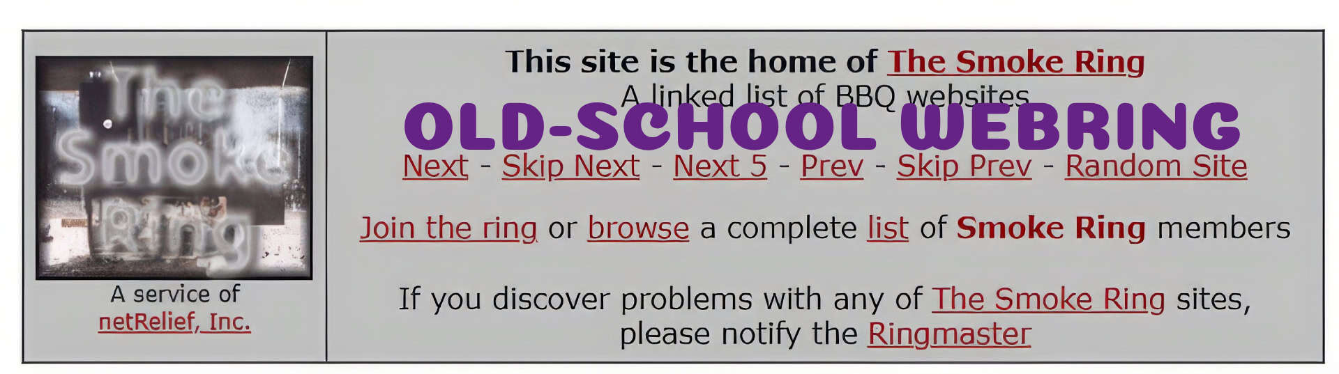
We Bring the Ring: The Rise and Fall of Old-School Webrings
It was like joining a secret society. Except the secret was Sailor Moon fanfic and a blinking “Next” button.
What Was a Webring?
Picture this:
You’re deep in a fan site for Sailor Moon. You scroll to the bottom. There’s a little badge that says:
🌙 “Member of the Moonlight Magic Ring.”
[Previous] [Next] [Random] [Join Us]You click “Next” and – bam – you’re on someone else’s Sailor Moon shrine. And they have a badge too. And so on. And so on.
That’s a webring.
A circle of sites, linked by a shared passion and a willingness to copy-paste some sketchy HTML.
The Culture of the Ring
Webrings were:
- Personal
- Niche
- Hand-curated
- Occasionally broken
They were built by fans, hobbyists, and chaos magicians of HTML. There was no algorithm. No platform. Just vibes and trust.
And they worked.
You discovered amazing sites. Made friends. Sometimes even got into ring drama. (Yes, people beefed over who was let in. Humans are consistent like that.)
How They Worked
- You found a ring that fit your site’s theme
- You applied to join (via actual email)
- If accepted, you were told to copy a widget and slap it on your homepage
- That widget looped users through the ring (previous/next/random)
It was basically…
DIY discovery.
Curated coolness.
Social connection without the noise.Why They Disappeared
- The rise of social media and Google made centralized discovery easier
- Many rings died when host sites went offline
- People just forgot how special they were
And let’s be real – they were a bit janky. If one site broke the chain, the whole ring could glitch like a cursed necklace.
But Now? They’re Coming Back.
Because people are tired of the algorithm.
Tired of fighting for attention.
Tired of yelling into the void of social media with no response.
Webrings say: “Hey. If you’re here, you belong.”
That’s powerful. That’s personal. And that’s the future we’re rebuilding.
Join the Revival
Cringe Web Weekly lives on a modern webring and you can start one, too.
Try Webring Studio if you’re craving:
- Custom vibe-based rings
- Easy setup (no cursed HTML required)
- Tiny tools that feel like home
-

Font Crimes We’d Absolutely Commit Again
Because we didn’t choose Comic Sans. Comic Sans chose us.
Hello. This Is Comic Sans. Respect Me.
The fonts we used on our first websites weren’t chosen for readability. They were chosen for vibes.
And those vibes? Usually somewhere between middle school talent show flyer and ransom note written by a unicorn.
The Usual Suspects
Let’s take a moment to remember (and lightly judge) the fonts that shaped our web:
Comic Sans
Used for: “About Me” pages, pet photo captions, passive-aggressive teacher flyers
Vibe: Chill. Casual. Possibly allergic to criticism.
Justice for Comic Sans? Maybe.

Papyrus
Used for: Poetry pages, elf bios, anything vaguely spiritual
Vibe: I burned incense once. I have opinions on Atlantis.
Forever cursed by: Avatar (2009)

Jokerman
Used for: Party invitations, “fun” buttons, bold declarations
Vibe: The font equivalent of honking your own nose.
We knew. We used it anyway.

Curlz MT
Used for: Scrapbook sites, teen girl diaries, “My Friends” pages
Vibe: I doodle hearts in the margins and I am not OK.
Still adorable? Possibly. If used responsibly (read: never).

Impact
Used for: Meme ancestors, angry headlines
Vibe: Yelling. Always yelling.
Still with us today: unfortunately, yes

We Didn’t Know Better (And We Did Not Want To)
There were no design systems. No font pairing guides. No accessibility checkers whispering, “Maybe not hot pink Curlz on black marble.”
There was just a drop-down menu and a dream. And we picked the loudest dream we could find.
What We Can Learn From Bad Typography
- You don’t need to be good at design to put something out there
- Making something weird, heartfelt, and very purple still beats staying silent
- The fonts may change, but the need to express yourself never goes out of style
If You’re Feeling Brave
Go ahead. Drop some Comic Sans on a test site.
Use Jokerman for a single subheading and see how long your retinas survive.
Make a “Font Crimes” badge and wear it like a glitter sticker from 2003.
The internet was never supposed to be perfectly kerned. It was supposed to be yours.
-

Guestbook Graffiti and the Lost Art of Signing Off
Because “Sign my guestbook!!!” was the comment section before comment sections existed.
Before comment sections. Before likes. Before Reddit upvotes or Discord reactions… There was the guestbook.
A single magical box where strangers, friends, and bots pretending to be friends could leave you a message. And not just a quick “cool site.” Oh no. This was performance art.
You didn’t just comment – you signed off.
An Autograph from the Web
A proper guestbook entry included:
- At least three tildes, asterisks, or heart emojis in your name
- A compliment that was slightly too excited: “OMG I LOVE UR SITE SO MUCH!!!”
- A link to your own page, usually something like: http://firepixie33.tripod.com/buffyzone2.html
You had to leave your link. It was like the unwritten rule of digital reciprocity: I visit your world, you visit mine.
Yes, It Was Mostly Spam Eventually
Eventually, the bots came. The weird scripts. The “buy sunglasses here” messages. And many of us, hearts broken and pages forgotten, turned guestbooks off forever.
But before that? They were sacred scrolls of community.
Signing Off, Digitally
Even your sign-off mattered. These were some of the classics:
- ~Peace, Love, & HTML~
- ♥Keep On Scrollin’♥
- L8r Sk8r
- Stay sweet, never change (yes, like yearbooks)
- ((HUGS)) from Crystal@AngelKissNet
The early internet wasn’t quiet. It was loud, sparkly, and emotionally available. And guestbooks were where it poured out.
Why It Still Matters
Guestbooks weren’t polished. They weren’t threaded. But they were intimate.
A stranger saying “Cool site” meant something. It meant they stayed. They clicked. They saw you.
And now, in an era of fast scrolls and filtered feeds, maybe we could learn something from that.
Want to Bring It Back?
We’re not saying you need a guestbook. (But also… you could.)
Here are a few tools you can use to add some old-school interactivity to your site – without the spam apocalypse:
- Cusdis – Lightweight comment system
- Giscus – GitHub-powered discussion threads
- Guestbook revival toolkits – because yes, they’re still out there
-

Cringe, Sparkle, Scroll: A Love Letter to Our Old Websites
The blink was strong in us. And we have no regrets.
The Good Old Awful Days
There was a time – a simpler time – when every website was a chaotic masterpiece. When we coded in Notepad, uploaded via dial-up, and thought “design consistency” was something only big corporations worried about.
Welcome to that time.
Let’s revisit the glorious sins of early web design, from our spinning skull dividers to those unskippable splash pages we swore were important.
Hall of Fame (or Shame?)
1. The
<blink>tag
Because blinking text wasn’t just annoying — it was essential. “LOOK AT ME,” it screamed. And we did. Until our eyes gave up.OMG BLINKING TEXT
2. The Under Construction GIF
Nothing says “I haven’t updated this page since 2003” quite like a pixelated worker with a shovel. Bonus points if it said “Pardon the dust!”
3. Autoplay MIDI Music
You came for the fanfiction. You stayed because you couldn’t find the pause button. Now playing: My Heart Will Go On… forever.
4. Neon Text on Galaxy Backgrounds
We wanted our sites to look cosmic. Instead, they looked like Lisa Frank met Windows 95 at a rave.
5. Cursors That Sparkled (or Bled Fire)
Nothing made you feel more powerful than leaving a glitter trail behind your mouse. It was like tagging the web with joy. Or chaos. Mostly chaos.
6. Hit Counters That Started at 0
Because self-esteem = how many strangers accidentally clicked your link. “You are visitor #0000013!”
7. The All-Caps Welcome Message
“WELCOME TO MY HOMEPAGE!!! PLEASE SIGN MY GUESTBOOK!!!”
We were friendly. We were loud. We were possibly caffeinated.
8. Marquees for Everything
If it didn’t scroll, did it even matter?Why It Still Matters
All jokes aside, those early sites were raw, personal, and weird in the best way. They weren’t chasing SEO, conversion rates, or brand cohesion. They were about expression. Experimentation. And connection.
They had soul.
And in this era of polished perfection and algorithmic sameness, maybe a little soul is exactly what the web needs.
Want to Make a Site That Feels Like You?
You don’t need sparkly cursors or blinking text (unless you really want them). But you do need a space that feels like home. Check out these indie-friendly tools and start your little corner of the web – chaos optional.
Now if You’ll Excuse Me…
I’ll be in the corner, converting a MIDI file to MP3 and crying over my old guestbook entries.