Your cart is currently empty!
Galaxy Backgrounds & Neon Fonts: Sites That Burned Bright, Then Blinded Us
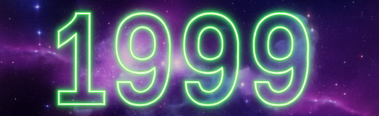
Because contrast is for cowards and black starfields were the ultimate vibe.
The Look That Launched a Thousand Squints
There was a moment – a long, glitter-filled, typo-heavy moment – when every site owner realized: “I can upload my own background.”
And instead of subtle textures or light gradients, we chose: Stars. Nebulas. Exploding purple comets.
Because our sites weren’t just homepages. They were portals.
The Classic Combo
The design trifecta went something like this:
- Tiled starfield background (seamlessly repeating? not likely.)
- Neon green text (often bolded, italicized, or blinked)
- Cursors with glitter trails (yes, again)
- Headers in Curlz MT or Papyrus
- And maybe a low-opacity fairy GIF, just hanging out in the corner
If your site didn’t look like the MySpace profile of a space witch – were you even online?
Contrast? Accessibility? What Are Those?
The brighter the font, the more powerful the magic.
And if the background made it hard to read? Good. You had to want it.
Text wasn’t meant to be skimmed. It was meant to be sought.
And possibly highlighted with your mouse just to read.
Backgrounds We Absolutely Used Anyway
- Black with sparkles (generic galaxy)
- Purple nebula swirls (probably stolen from a NASA JPEG, which is fine)
- Crescent moons and clouds (for poetry pages)
- Faded pastel stars (for dreamy friend pages)
- Technically black, but with 4px white pixel noise (for texture)
Bonus points if you layered a low-res animated gif on top of it all.
Nothing says welcome like a glowing Ankh spinning over the Horsehead Nebula.
Why We Loved It
- Because it felt vast.
- Because it made your 300-word fan poem feel like it belonged to the universe.
- Because the internet was freedom, and space was the ultimate metaphor.
It wasn’t design. It was digital astral projection.
Bring It Back? (Responsibly)
If you must:
- Use a dark star texture as a fixed background behind a content wrapper
- Limit neon to accents (or go full ironic and warn your visitors first)
- Use background-attachment: fixed for modern floaty vibes
- Or embed one post in full retro mode with a toggle switch: “Click here to experience this in 1999 Splendor”
Written by:
Konnectsus (also known as Donna in real life)
She is the founder of Webring Studio, helping kindred sites find each other again – quietly, intentionally. One link… one ring at a time, she connects us.