Your cart is currently empty!
Category: Culture & Commentary
-
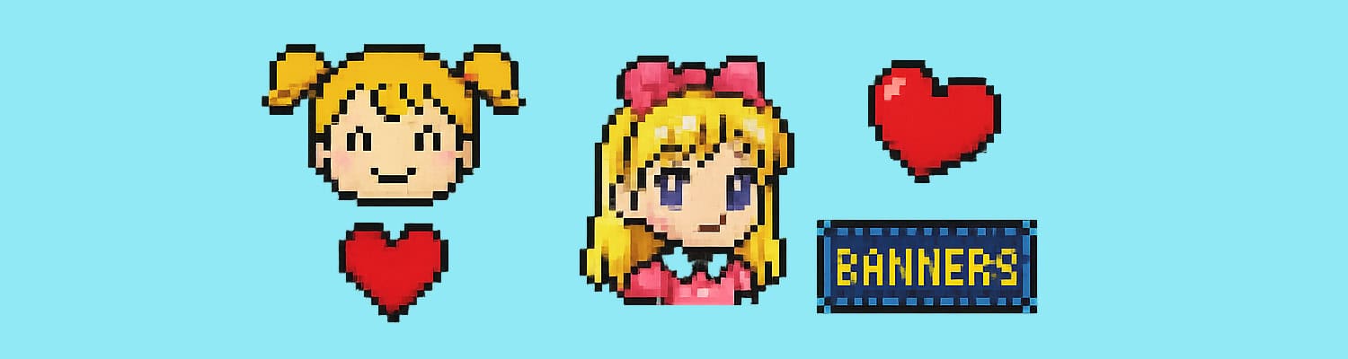
Tiny Treasures: Blinkies, Adoptables, and Banners That Carried Our Online Souls
We didn’t always know what they were called. We just knew we loved them.
We Didn’t Know the Names – We Just Needed Them
Sometimes they were called blinkies. Sometimes “mini buttons.” Sometimes “my pixels” or “those little sparkle graphics I got from that one site with the purple fairy background.”
Most of the time? We didn’t call them anything.
We just right-clicked > Save As, uploaded them to our site, and arranged them in neat little rows of joy.
Because they were more than just decorations. They were identity. They were personality pixels.
They were everything.
The Blinkie Bar
Blinkies were small – usually 88×31 or 150×50 pixels – and full of attitude.
They blinked. They sparkled. They told people how we felt before they read a single word of our poetry page.
Examples:
- “I Code By Moonlight”
- “Fandom Trash”
- “You Say Geek Like It’s a Bad Thing”
- “I Bite Back”
- “Not Your Pixel Princess”
They were like glitter-sticker bumper cars for the soul.
The Adoptable Era
We didn’t have NFTs. We had pixel dragons and glitter wolves. And they were ours.
You’d visit a page, fall in love with a tiny creature named Shadowpaw, and click “Adopt Me!” Then copy the code and paste it on your Adoptables page, usually introduced like this:
“These are my pixel babies. No stealing please. I feed them daily with love and HTML.”
There were rules. You had to:
- Link back to the original site
- Keep the name
- Treat them with pixel respect
- Never hotlink (or the curse of the broken image box would follow you)
Some of us had dozens Some gave them little bios. One person you knew had a whole page called “The Sanctuary.”
That person? Was you.
The “Link Me” Shrine
If someone loved your site, they’d link to it with your official “Link Me” button – a glittery banner you made in MS Paint and called art.
It looked like this:
The Wild Forest
Click Here 2 Enter
wildddforest.comUnderneath, you’d offer the code:
<a href="https://wildddforest.com">

  <img src="linkme.gif" alt="Link Me">

</a>
And next to it:
“NO DIRECT LINKING. Upload to your own server.”
Because we were serious.
Why It Mattered
We weren’t just customizing websites. We were building altars. Decorating digital lockers. Carving our identities into glittery stone.
Each blinkie meant something. Each adoptable was a reflection. Each banner said:
“This is my vibe. This is my space. This is me.”
Final Thought
We didn’t always know what these were called. But we knew we needed them.
We found them. We collected them. We arranged them like sacred charms on our site’s sidebar.
And in doing so? We made our pages feel alive.
-
Dividers of Destiny: The Sacred Graphics That Split Our Souls
Because sometimes a regular horizontal line just didn’t scream “this is where my poetry ends.”
Once Upon a Time, <hr> Wasn’t Enough
You needed a line to separate your About Me section from your Vampire OC Lore.
But a plain grey bar? Absolutely not.
You needed sparkle. Edge. Fire.
Something that said: “This site was handcrafted by a moon priestess using Notepad and vengeance.”
The Sacred Divider Aesthetic
- Horizontal bars that looked like they were forged in the pits of Mount Doom
- Glittery pastel lace lines for your “Dreams and Visions” tab
- Mystical runes made entirely of low-res pixel art
- Blood-drip dividers for your Buffy/Dracula crossover fanfiction
- Animated rainbow bars for your “Friendz Only” blogroll
Bonus points if they:
- Had a glowing edge
- Were 480px wide but stretched weird on certain browsers
- Linked back to a “Free Graphics” site with 300+ midis and a curse on it
We Didn’t Just Use Dividers – We STACKED Them
You didn’t stop at one.
You used:
- One divider before the title
- Another after it
- A different one before each poem
- A sparkle line before the guestbook
- A flame bar before the copyright
- And sometimes… you just dropped a few in for vibes
Sample Divider Rituals
*******
-::|:::::[+]:::|::-
<img src="firedividerbar.gif" width="100%" height="20">Or this sacred rite:
<center>

  <img src="https://www.angelfire.com/freaks/freegraphics/fire-divider.gif" alt="~*~Fire Divider~*~">

</center>
That divider was blessed. You felt it.
Sources We Swore Allegiance To
- Luna’s Mystical Graphics
- GlitterKitty’s Sparkle Setz
- DarkAngel-Designz.neocities.org
- FireSkullZ Realm of HTML Art
- Tripod.com/users/emoFairyAssets5
(“PLZ link back and don’t hotlink!!!”)
We didn’t steal images. We borrowed the magic.
Final Thought
These weren’t just dividers. They were visual spells.
They turned your plain little webpage into a ritual space. They made each scroll feel like flipping a page in a forbidden spellbook.
They were unnecessary. Unreadable. And unbelievably good.
-
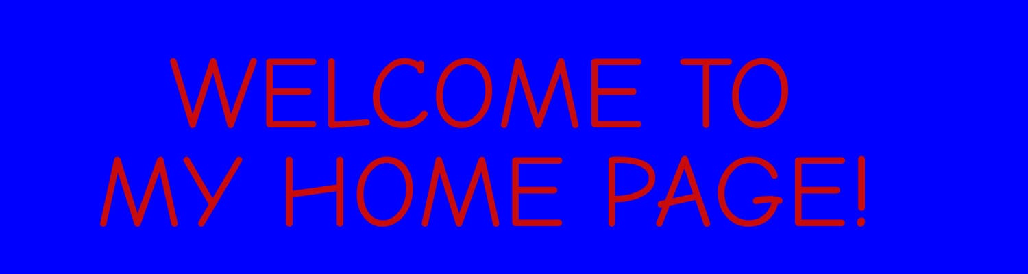
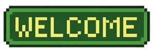
All Caps – WELCOME TO MY HOMEPAGE!!!
HI! I’M SO GLAD YOU’RE HERE!!!
You click the link.The page loads.
And BAM – a wall of text hits you in the face like an overexcited chihuahua with a keyboard:
WELCOME TO MY SITE!!! I HOPE YOU LIKE IT!!! PLEASE SIGN MY GUESTBOOK!!!
Everything was all caps. Everything had three exclamation points. Everything was friendly, okay?!
Why We Did It
- To grab attention
- To seem exciting
- Because lowercase looked “boring”
- Because the caps lock key was a commitment, not a mistake
We weren’t yelling out of anger. We were yelling with love.
Common Variants Included
- HI MY NAME IS KAYLA AND THIS IS MY POETRY PAGE!!!
- WELCOME 2 MY PAGE!!!!!!!
- CLICK THE BUTTONS ABOVE TO SEE MY DRAWINGS!!!!
- PLZ DON’T STEAL MY GRAPHICS!!!!! THX!!!!!
- I ♥ VAMPIRES 4EVER
And let’s not forget the iconic hybrid form:
“WELCOME TO MY WORLD~~ Plz sign my g-book xoxo <3”
Lowercase letters were only allowed in the guestbook – and even then, barely.
When It Got Really Serious
You knew it was time to feel something when the caps turned into Title Case: This Page Is Dedicated to My Angel Baby Skylar ~ Gone Too Soon
But otherwise? Caps were the default font of the people.
Design Choices That Made It Louder
- Rainbow gradient font
- Sparkle overlays
- Blink tags (obviously)
- Gothic or graffiti typefaces in all caps
- Drop shadow + outer glow + inner glow + pattern overlay = welcome message from the void
Was It Good Design?
No.
Was it honest? Was it joyful? Was it unapologetically enthusiastic to exist?
Yes.
That welcome message wasn’t a brand hook. It was a handshake.
Want to Bring It Back?
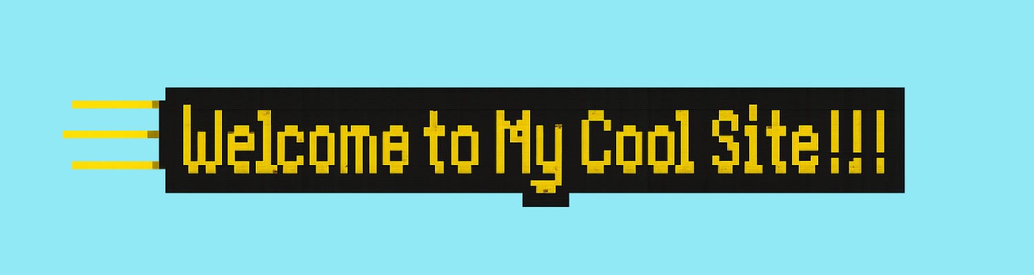
<h1 style="text-align:center; font-family:Comic Sans MS, cursive; color:#ff00ff; text-shadow: 1px 1px #000;">

  WELCOME TO MY SITE!!!

</h1>
No, it’s not mobile-friendly. Yes, it might summon an angel-fire spirit guide. Do it anyway.
-
Marquees for Everything: If It Didn’t Scroll, Did It Even Exist?
Because shouting your feelings in a slow crawl across the screen just felt right
Welcome to the Scroll Zone
In the beginning, websites were still. Then someone said,
“But what if… the text moved?”
And thus, <marquee> was born.
It scrolled horizontally. It scrolled vertically. It bounced like a cat in a cardboard box.
And it was glorious.
What Did We Use It For?
- Welcome messages
<marquee>Welcome 2 My Page!!!</marquee> - Poetry snippets
“i wrote this in my notebook during math class”
Crush declarations
💖 “I ❤️ u Michael B 4ever”
Song lyrics
You wouldn’t get it. It was angsty.
And let’s not forget…Site-wide announcements that definitely deserved to loop endlessly in Comic Sans.
The Marquee Settings We Exploited:
<marquee direction="left" scrollamount="3" behavior="alternate">

  Check out my blogroll!

</marquee>
I mean…bounce, baby!
The Modern Dopamine Comparison
Back then, we used <marquee> to beg for attention. Today, we post for likes.
But let’s be honest:
- In 2003, we watched our words scroll by and thought, “Someone will see this.”
- In 2025, we post a Reel and watch for that little red heart.
- It’s the same impulse — just wrapped in a slicker UI.
Marquees were the original digital dopamine drip.
They just didn’t come with analytics. Or ads. Or infinite scroll.
(Just… scroll you had to manually add and tune with trial and error.)
Why We Loved It
Because it added movement. It said look at this in a way that bold and underline just couldn’t. It made our pages feel alive.
And sometimes? It just looked cool.
Why It Was… Not Great
- Accessibility nightmare
- Often unreadable
- Usually unnecessary
- Frequently paired with neon fonts and busy backgrounds
- Occasionally looped forever and ran off the edge of the browser like a lemming with a dream
But… it still kind of slaps.
Want It Back? We Got You.
<!-- For nostalgia and chaos only -->

<marquee behavior="alternate" scrollamount="5">

  Welcome back to the old web.

</marquee>
Or for modern devs with a guilty conscience. Use CSS animations instead and call it “retro kinetic branding.”
Final Thought
Maybe the marquee was our version of posting a story. It faded. It looped. It felt urgent.
It said: “This is me. This matters. Please watch.”
Even now, that impulse hasn’t left us. It just got an algorithm and an explore tab.
- Welcome messages
-
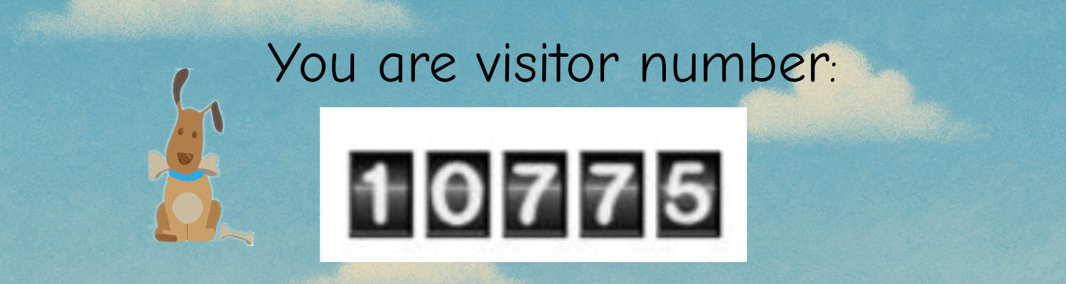
Hit Counters That Measured Our Worth (And Missed It By a Lot)
Because self-esteem came in five digits, preferably blinking.
You Are Visitor Number… Something Meaningful, Probably
You know the one. That little strip of digits Sometimes plain. Sometimes spinning. Sometimes shaped like a barcode or a flip clock. Always important.
Because the number didn’t just show traffic. It showed value. Or so we told ourselves.
Why We Used Them
- To prove someone had been there
- To prove we had been there (repeatedly)
- To compete with our friends’ sites
- To get that sweet, sweet dopamine bump when it hit 100 (or, you know, 9)
- And most importantly: To not feel alone in the HTML void
Where Did They Come From?
We’d copy a snippet of JavaScript or PHP from sites like:
- Bravenet
- Extreme Tracking
- WebCounter
- StatCounter
- That one Geocities widget that broke half the time
Sometimes they worked. Sometimes they broke. Sometimes they reset back to 001 for no reason other than betrayal.
What They Told Us (That Wasn’t True)
- That our site was important
- That someone out there cared
- That traffic = success
- That 0013 meant we had exactly 13 fans (and definitely not 12 of those being us)
We watched those digits like oracles. And when they didn’t move? We reloaded the page to give ourselves a boost.
Don’t lie. You did it too.
Cringe Enhancements We Absolutely Loved
- Animated digits that lit up as they flipped
- Old-school LCD number fonts
- Hit counters with exploding animations at 1,000
- “You are visitor #666 — behold the darkness!”
And yes… sometimes we manually edited the number to something bigger. Because who was going to check?
Comments Came Later — But This Was First
Hit counters were the first feedback loop many of us ever saw online. They were numbers. But they felt like applause.
Do You Want One Now?
Well, the easiest way to do this is simply typing whatever you want to say and putting a number in there. It’s no less accurate, frankly. Here is an example:
“You are visitor #0000001 — and you are the chosen one.”
-
Galaxy Backgrounds & Neon Fonts: Sites That Burned Bright, Then Blinded Us
Because contrast is for cowards and black starfields were the ultimate vibe.
The Look That Launched a Thousand Squints
There was a moment – a long, glitter-filled, typo-heavy moment – when every site owner realized: “I can upload my own background.”
And instead of subtle textures or light gradients, we chose: Stars. Nebulas. Exploding purple comets.
Because our sites weren’t just homepages. They were portals.
The Classic Combo
The design trifecta went something like this:
- Tiled starfield background (seamlessly repeating? not likely.)
- Neon green text (often bolded, italicized, or blinked)
- Cursors with glitter trails (yes, again)
- Headers in Curlz MT or Papyrus
- And maybe a low-opacity fairy GIF, just hanging out in the corner
If your site didn’t look like the MySpace profile of a space witch – were you even online?
Contrast? Accessibility? What Are Those?
The brighter the font, the more powerful the magic.
And if the background made it hard to read? Good. You had to want it.
Text wasn’t meant to be skimmed. It was meant to be sought.
And possibly highlighted with your mouse just to read.
Backgrounds We Absolutely Used Anyway
- Black with sparkles (generic galaxy)
- Purple nebula swirls (probably stolen from a NASA JPEG, which is fine)
- Crescent moons and clouds (for poetry pages)
- Faded pastel stars (for dreamy friend pages)
- Technically black, but with 4px white pixel noise (for texture)
Bonus points if you layered a low-res animated gif on top of it all.
Nothing says welcome like a glowing Ankh spinning over the Horsehead Nebula.
Why We Loved It
- Because it felt vast.
- Because it made your 300-word fan poem feel like it belonged to the universe.
- Because the internet was freedom, and space was the ultimate metaphor.
It wasn’t design. It was digital astral projection.
Bring It Back? (Responsibly)
If you must:
- Use a dark star texture as a fixed background behind a content wrapper
- Limit neon to accents (or go full ironic and warn your visitors first)
- Use background-attachment: fixed for modern floaty vibes
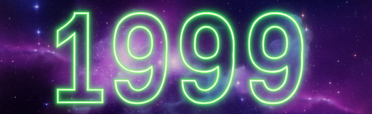
- Or embed one post in full retro mode with a toggle switch: “Click here to experience this in 1999 Splendor”
-
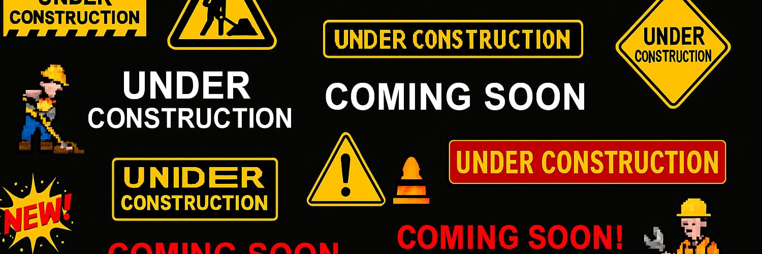
Under Construction Forever: The GIF That Never Died
Because your site was always under construction. And you were proud of it.
This Page Is Under Construction – Please Come Back Later
There it was. A guy with a hard hat. A blinking sign. Maybe a jackhammer.
Sometimes animated. Always pixelated. Often surrounded by asterisks.
Your site might have had no content. But it had purpose.
And that purpose was: “I’m totally going to update this page eventually.”
(Reader: We never did.)
Why We Loved It
- It made us feel official
- It implied exciting things were coming
- It bought us time while we Googled “how do I center a table”
- And honestly? It just looked cool
The construction GIF wasn’t a delay. It was a declaration.
The Infinite Loop of “Coming Soon”
We used entire pages as placeholders. Not just for content – for vibes.
Welcome to my website!!!
Pages coming soon:
- About Me
- Poetry
- Vampire Art
- Rants
- My Friends
- Blinkies
- My Soul
And then we never touched them again.
Iconic GIFs of the Era
- Pixel man with a shovel
- Blinking caution barricade
- Wrench twirling forever
- “Coming Soon” in 8-bit neon hell-font
- Flashing “NEW!” starburst (even though nothing was there)
If your site had three visitors, one of them was a blinking GIF.
Bonus Cringe: Dividers of Doom
Because what is a site under construction without mystical line breaks?
The Divider Starter Pack
- Fire bar with tribal edges
- Crescent moon and star dividers
- Horizontal rules made of dragons, vines, or pixels
- Glittery sparkle bars with drop shadows
And of course…
“Free Graphics From Luna’s Magic Castle”
(Please link back. Do not steal. Blessed Be)
Why It Still Slaps
Yes, it was cringe. Yes, it was chaos.
But it told visitors something important:
“I care. I’m working on this. This space matters to me.”
And you know what? That’s still beautiful.
Want to Add One Now?
You bet your spinning cone you do.
Here’s a real HTML embed you can drop into your post footer, just for the vibes:
<!-- Cursed but proud -->

<img src="https://www.animatedimages.org/data/media/1397/animated-under-construction-image-0009.gif" alt="Under Construction" />
Or sprinkle one mid-post like a warning from the glitter gods.
-
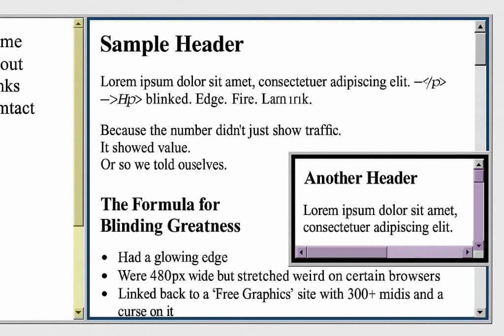
Scrollbars, Frames, and Other Crimes Against UX
Because why have one scrollbar when you can have four fighting for dominance?
Before There Was UX, There Was… Whatever This Was
UX? Never heard of her.
Back in the day, if your site didn’t break a browser at least once, were you even trying?
Let’s honor the chaotic brilliance of web layouts that were 97% scrollbars, 2% content, and 1% hope.
Crimes of Layout We Fully Committed
Framesets
You could split your page into multiple panels, each scrolling independently.
Header frame. Sidebar frame. Content frame. Bottom “don’t forget to sign my guestbook” frame.
It was like building a digital house where none of the doors lined up.
Nested Scrollbars
Sometimes you’d scroll… inside a box… that was inside another box… and the page itself also scrolled.
Because layering was art, and logic was optional.
Tiny iFrames in Tiny Boxes
Want to show off your favorite Neopets guild? Slap it in a 150×150 iframe with no padding and let it suffer.
Fixed Backgrounds with Moving Content
Because what’s more readable than hot pink text flying over a slowly tiling galaxy background?
Accessibility? We Thought That Was a Mood
- Font size: 10pt or bust
- Scrollbars: the more the merrier
- Navigation: deeply optional
- Mobile optimization: lol what
We weren’t building websites. We were building puzzles. And the prize was a blink tag and an auto-playing MIDI file.
But Why?
- Because it felt powerful.
- Because building multi-column frames made us feel like developers.
- Because we could.
And honestly? Because we had zero templates. Just raw HTML, Notepad, and vibes.
Should You Try It Again?
No.
Okay maybe once. As a treat.
If you’re brave, here’s a retro-coded frameset starter you can laugh and cry over:
<frameset cols="25%,75%">

  <frame src="nav.html">

  <frame src="content.html">

</frameset>
No CSS. Just chaos.
Want your page to look really authentic?
Wrap it in a nested <table> and whisper “forgive me” to the W3C.
Final Thoughts
Was it good design? No.
Was it accessible? Not even close.
Did we love it? Absolutely.
Because back then, your website was a sandbox. You weren’t following best practices. You were inventing your practices.
One <frameset> at a time.
-
MIDI or Die: Why Our Websites Sang Without Consent
Because you didn’t ask to hear My Heart Will Go On, but your dial-up connection played it anyway.
The First Sound of Chaos
You’d click a link on a friend’s AIM away message. A new tab would open. The screen would load sloooowly.
And then, suddenly: DUN-dun-dun-DUN-dun…
The Titanic theme. On loop. In MIDI. Forever.
No warning. No pause button. No escape. Just 47kb of pure emotional ambush.
Why We Did It Anyway
Because we could. Because silence was boring.
Because nothing said “this is my deeply personal Dragonball Z fan page” quite like a MIDI rendition of Bring Me to Life.
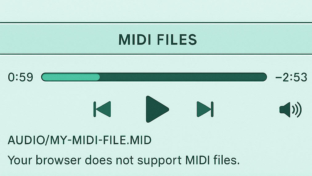
What Exactly Is a MIDI File?
A MIDI file isn’t an actual audio recording. It’s a digital sheet music file — like a robot whistling your favorite tune through a dial-up modem.
They were small. Fast-loading. And they made your site feel “professional.”
In the way that having a fog machine at a garage band show feels professional.
Loud. Questionable. Iconic.
Popular Offenses Included
- Titanic theme (Celine Dion MIDI supremacy)
- Evanescence – Bring Me to Life
- LOTR orchestral scores
- FF7 victory theme
- Linkin Park, Green Day, or In the End (played badly)
And if you had a fantasy, anime, or vampire site? You had to have a MIDI. It was in the code of the nerds.
The Problem With Autoplay
- No volume control
- No pause button
- Played on every page load
- Louder than your soul
If your speakers were on, your dignity was off.
Add One To Your Site (Responsibly… Ish)
Want to relive the chaos? You know you do.
Safe-for-2025 MIDI Embed:
<!-- MIDI Autoplay: For Brave Souls Only -->

<audio autoplay loop>

  <source src="https://files.khinsider.com/midifiles/movies/titanic-my-heart-will-go-on.mid" type="audio/midi">

  Your browser does not support MIDI files.

</audio>
Modern browsers may block this by default. And that’s probably for the best.
If you want to be extra dramatic, convert it to MP3 and try this instead:
<!-- Cringe Warning: MIDI Madness Reimagined -->

<audio autoplay loop>

  <source src="your-audio.mp3" type="audio/mpeg">

  Your browser does not support audio playback.

</audio>
Why It Still Matters
Early sites weren’t optimized. They weren’t quiet. They were vulnerable.
Autoplay music was cringe, yes. But it was also earnest.
It said: “This is my space. This is how I feel. This is my vibe — in audio.”
And honestly? That’s kind of beautiful.
-
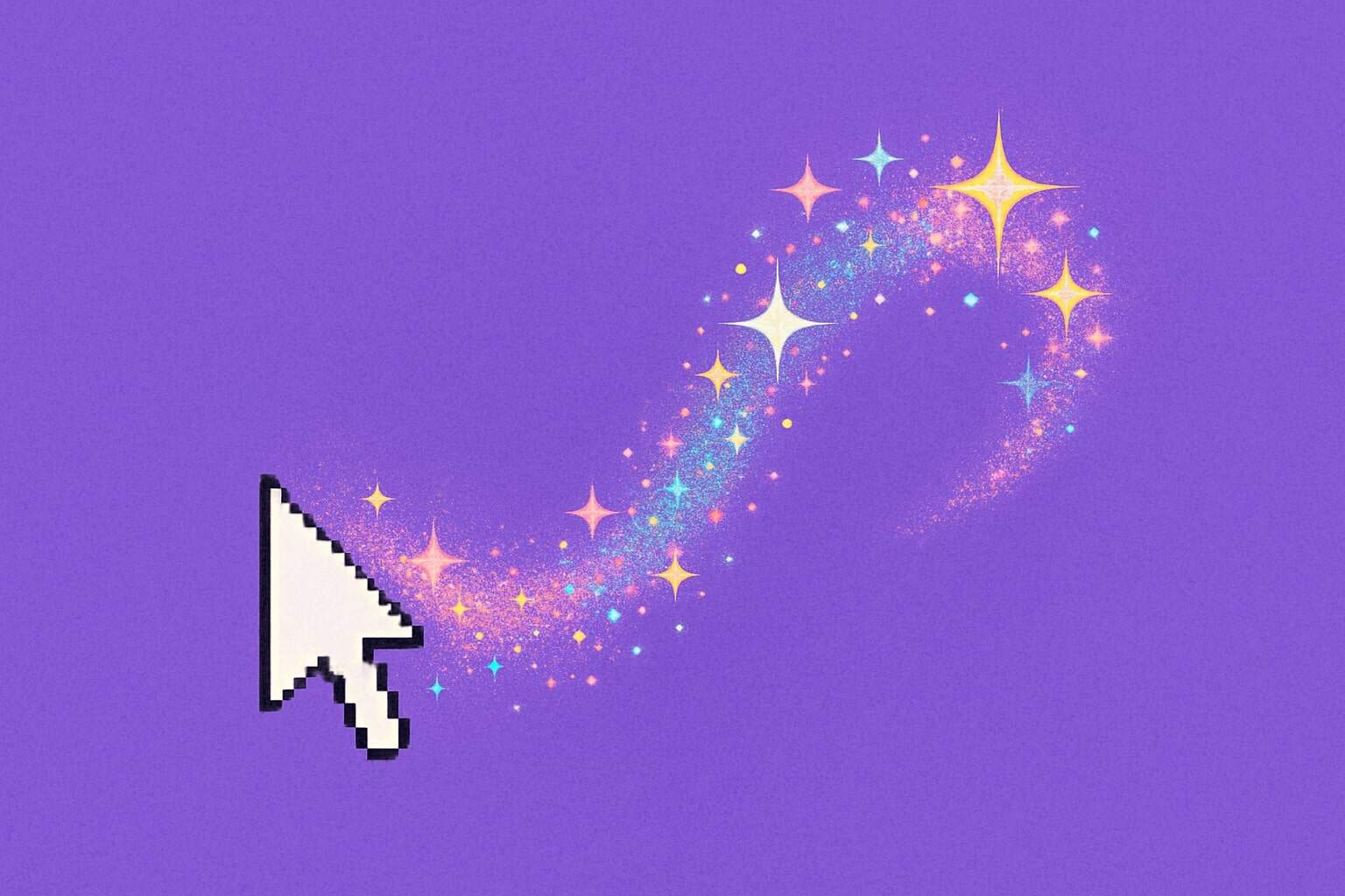
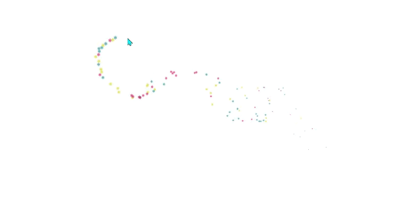
The Sparkle Curse: Why Every Site Had a Cursor Trail
Because your mouse pointer should have looked like it drank glitter and exploded.
It Started So Innocently
There you were, proudly loading your first HTML page in Netscape Navigator, admiring your tiled background and center-aligned text… and then it hit you:
“This needs more sparkle.”
What followed was one of the most defining aesthetic choices of early web design: the custom cursor trail.
Glitter. Fire. Stars. Butterflies.
All chasing your every move like enchanted breadcrumbs from a Lisa Frank fever dream.
The Cursor Trail, Explained
If you never experienced this majestic chaos, here’s what you missed:
Move your mouse → sparkles erupt behind it
Stop moving → the glitter lingers, gently dying off
Navigate a page → 37 frames drop to 12 fps and your CPU begs for mercy
It was magic. It was madness. It was ours.
Variants of the Sparkle Curse
Let us honor the cursor trail variations that glittered before us:
- Pink heart explosions – usually paired with a Sailor Moon shrine
- Shooting stars – ideal for astrology sites or anything hosted on Tripod
- Fire trails – beloved by gamers, metalheads, and 13-year-olds named “DarkWolfXx”
- Fairy dust – because glitter made it sacred
- Skulls and blood drips – for when your cursor needed edge
Performance? Never Heard of Her.
These scripts weren’t optimized. They weren’t responsive.
They were vibes, not code.
They lagged. They glitched. They crashed entire browsers.
And we did not care.
We wanted to sparkle, and if our visitor’s machine overheated… well, that was the price of beauty.
But Why Did We Do It?
Because it was fun. Because it was expressive.
Because it turned something ordinary into something fabulously unnecessary.
It said: “I built this site myself, and you’re gonna feel that.”
And honestly? We stand by that.
Should We Bring It Back?
No.
Okay… maybe. Sparingly. Responsibly.If you must relive the sparkle days, try:
- Cursor Effects on CodePen
- Light JS libraries that won’t tank your site
- A single, ironic sparkle trail on April Fool’s Day (or your birthday)
Just maybe… don’t do it to your homepage. Unless you really mean it.
In which case: do it hard.
- Pink heart explosions – usually paired with a Sailor Moon shrine