Your cart is currently empty!
Scrollbars, Frames, and Other Crimes Against UX
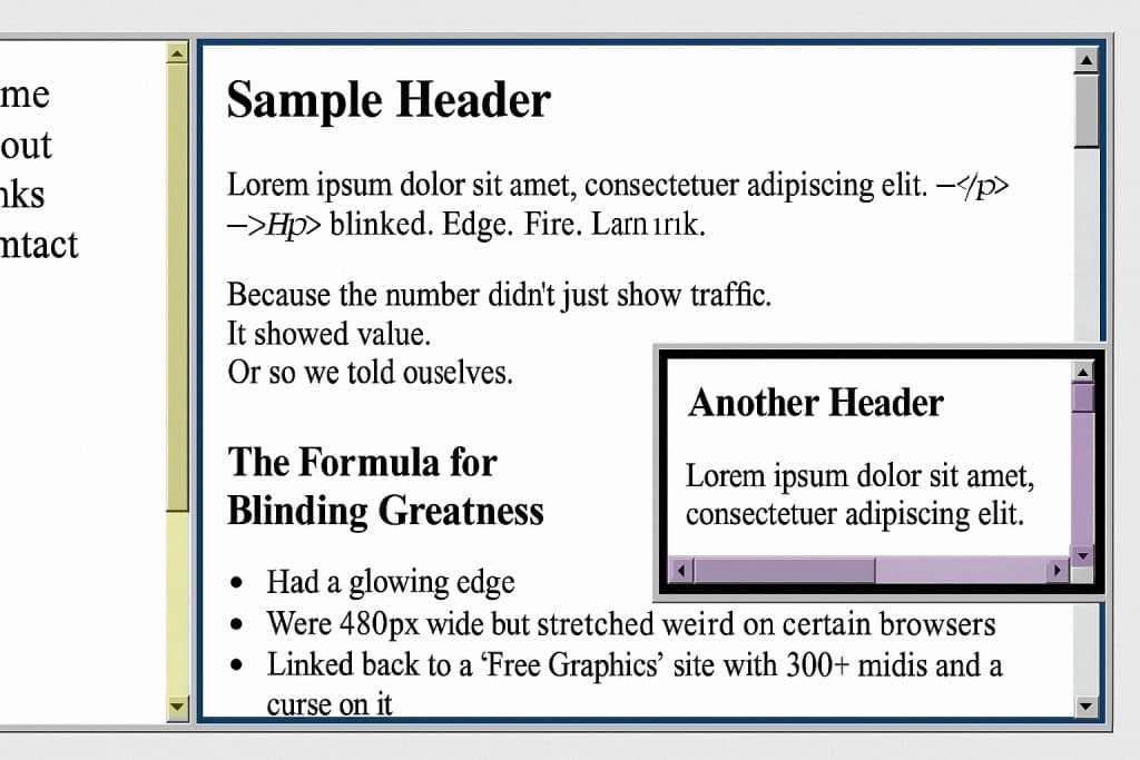
Because why have one scrollbar when you can have four fighting for dominance?
Before There Was UX, There Was… Whatever This Was
UX? Never heard of her.
Back in the day, if your site didn’t break a browser at least once, were you even trying?
Let’s honor the chaotic brilliance of web layouts that were 97% scrollbars, 2% content, and 1% hope.
Crimes of Layout We Fully Committed
Framesets
You could split your page into multiple panels, each scrolling independently.
Header frame. Sidebar frame. Content frame. Bottom “don’t forget to sign my guestbook” frame.
It was like building a digital house where none of the doors lined up.
Nested Scrollbars
Sometimes you’d scroll… inside a box… that was inside another box… and the page itself also scrolled.
Because layering was art, and logic was optional.
Tiny iFrames in Tiny Boxes
Want to show off your favorite Neopets guild? Slap it in a 150×150 iframe with no padding and let it suffer.
Fixed Backgrounds with Moving Content
Because what’s more readable than hot pink text flying over a slowly tiling galaxy background?
Accessibility? We Thought That Was a Mood
- Font size: 10pt or bust
- Scrollbars: the more the merrier
- Navigation: deeply optional
- Mobile optimization: lol what
We weren’t building websites. We were building puzzles. And the prize was a blink tag and an auto-playing MIDI file.
But Why?
- Because it felt powerful.
- Because building multi-column frames made us feel like developers.
- Because we could.
And honestly? Because we had zero templates. Just raw HTML, Notepad, and vibes.
Should You Try It Again?
No.
Okay maybe once. As a treat.
If you’re brave, here’s a retro-coded frameset starter you can laugh and cry over:
<frameset cols="25%,75%">

  <frame src="nav.html">

  <frame src="content.html">

</frameset>
No CSS. Just chaos.
Want your page to look really authentic?
Wrap it in a nested <table> and whisper “forgive me” to the W3C.
Final Thoughts
Was it good design? No.
Was it accessible? Not even close.
Did we love it? Absolutely.
Because back then, your website was a sandbox. You weren’t following best practices. You were inventing your practices.
One <frameset> at a time.
Written by:
Konnectsus (also known as Donna in real life)
She is the founder of Webring Studio, helping kindred sites find each other again – quietly, intentionally. One link… one ring at a time, she connects us.